

Mobile@HDB
The Mobile@HDB app redesign aims to streamline user interactions with the Housing and Development Board’s (HDB) services. With a focus on improving the digital experience, the app provides easy access to essential e-Services like flat applications, resale price checks, and car park searches. This redesign supports HDB’s goal of leveraging technology to enhance convenience and accessibility for over 1 million residents across Singapore.

Mobile@HDB App Redesign: Enhancing User Experience for Seamless Access to HDB Services
Goal & Timeline
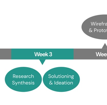
The goal of the Mobile@HDB app redesign is to create a more intuitive, user-friendly, and efficient platform for users. Through comprehensive user research, we identified key pain points and gathered feedback on housing and parking services. Using these insights, we streamlined navigation, improved accessibility, integrated advanced features, and simplified the overall user journey. The redesigned prototype was rigorously tested to ensure its effectiveness in enhancing the user experience.
Market Analysis





Core Functionalities: The Mobile@HDB app offers a wide range of services, including transactional services for flat applications, payments, and comprehensive information on Build-To-Order (BTO) flats, transacted prices, and nearby HDB service centres. It serves users with housing, business, community, and car park services.
Ease of Navigation: Navigation within the app is hindered by a cluttered in-app browser, with key features requiring multiple clicks to access from the home page. This limits the app's user-friendliness compared to competitors.
Information Access: Finding relevant information can be a challenge as it's spread across various pages, often requiring several clicks to access. This creates a more cumbersome experience compared to the streamlined designs of competing apps.
Interface Design: The app’s interface is cluttered and outdated, with a functional but visually dated design. There is a need for a more modern and intuitive layout to improve overall user experience.
We conducted a detailed comparison with leading industry apps like PropertyGuru and 99.co. While the Mobile@HDB app benefits from a high level of trust due to government backing, it lacks in user experience compared to these private sector apps. PropertyGuru and 99.co excel in intuitive design and effortless navigation, setting a high bar for what users now expect from real estate apps.
Core Functionalities: PropertyGuru provides a seamless platform for property searches, offering comprehensive information on both sale and rental properties. Key features include detailed property listings, virtual tours, price comparisons, and personalized recommendations based on user preferences.
Ease of Navigation: The app is highly intuitive, with a clean interface that allows users to easily filter and search for properties. Key features are accessible within just a few clicks from the home page, offering a streamlined user experience.
Information Access: PropertyGuru excels in information accessibility, presenting property details in a clear and organized manner. Users can find essential information, including pricing trends and nearby amenities, with minimal navigation effort.
Interface Design: The app’s design is modern and visually appealing, with a user-friendly layout that prioritizes ease of use. Property listings are well-organized, featuring high-quality images, interactive maps, and virtual viewing options, offering a premium user experience.
Core Functionalities: 99.co specializes in property listings for sale and rent, providing users with a comprehensive property search experience. It includes detailed filters, price comparisons, neighborhood insights, and the ability to save favorite listings. The app also features real-time property alerts and in-depth market analysis tools.
Ease of Navigation: The app offers an intuitive, user-friendly interface. Essential features such as property searches, filters, and saved listings are easy to access within a few taps, making navigation quick and straightforward.
Information Access: Information is clearly presented, with property details like price history, floor plans, and nearby amenities readily available. The search results are well-organized, and users can easily compare different properties based on their preferences.
Interface Design: The app has a clean, minimalistic design, emphasizing visual elements like high-quality images and interactive maps. The overall layout is sleek and easy to navigate, offering a modern, clutter-free experience that enhances usability.
We interviewed 35 users show that the current Mobile@HDB app lacks value. It redirects users to an online browser and presents too much scattered information and this makes navigation difficult and confusing. Users expressed a need for step-by-step guides and checklists for each stage of the HDB journey. They prefer to use their mobile devices for quick information access and simple services like application tracking and straightforward transactions.


User Research
The current Mobile@HDB app does not offer any value-add, it just keeps leading me to an in-app browser.
There is so much information everywhere, it’s hard to navigate and I’m still unsure about what I’ve read.
I think a step-by-step guide or a checklist for each stage of the HDB journey would have been very helpful.
I prefer to use my mobile for information-finding on the go or for the simpler services such as tracking my application status and straightforward transactions.
I can’t use the search function.
The app is outdated and difficult to use.
I’m not able to renew my season parking.
The app only redirects us to the website!


User Persona
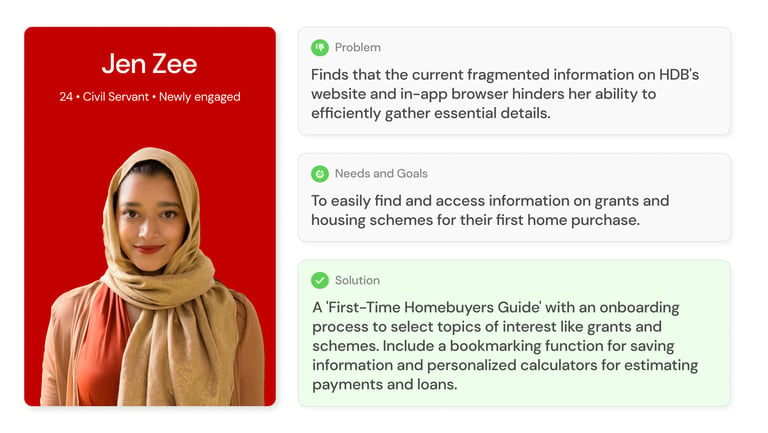
To ensure the Mobile@HDB app redesign met the needs of its diverse users, we conducted in-depth user interviews and developed detailed personas based on key segments, including BTO applicants, season parking users, and prospective homebuyers. These personas, such as Betty Oh, Peter Parker, and Jen Zee, encapsulate the unique challenges and goals of each user group. Each persona includes specific problem statements, "How Might We" questions, and tailored solutions, providing a clear framework to guide our design decisions.
The personas and site map we created from these insights allowed us to maintain a human-centered design focus throughout the project, aligning both the design team and stakeholders with the real needs of users.
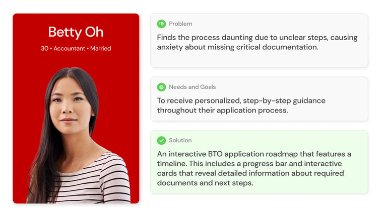
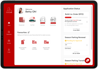
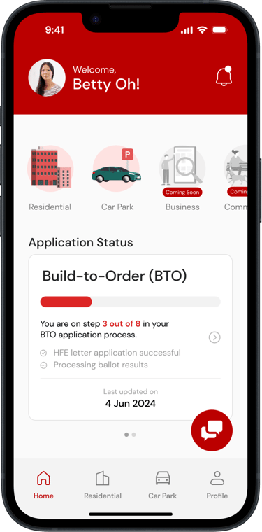
Meet Betty Oh. Betty is currently applying for a BTO but finds the process daunting due to unclear instructions and lack of real-time updates. To help her, we've developed 'Your BTO Journey,' an interactive roadmap with a progress bar and interactive cards that guide her through each step
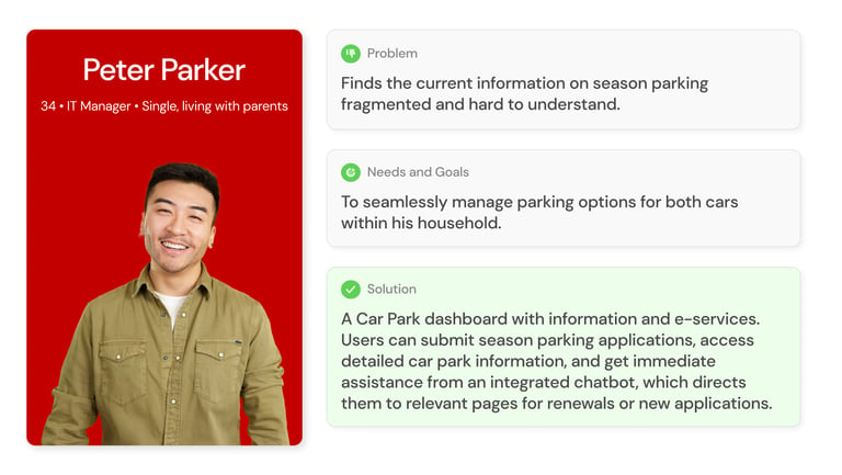
Peter's main frustration is understanding season parking information. He wants to manage parking options seamlessly for his household, as his parents are less tech-savvy. Our solution is a Car Park dashboard with comprehensive information and e-services. Peter can apply for, renew, or transfer season parking, access detailed car park information, and get immediate assistance from an integrated chatbot.
Lastly, meet Jen Zee. Recently engaged, Jen is looking to buy a new home but finds it challenging to gather necessary information, especially on grants and schemes. Our solution includes an onboarding process for selecting topics of interest, a bookmarking function for easy access to important information, and an in-app personalized calculator for estimating payments and loans.
Information Architecture
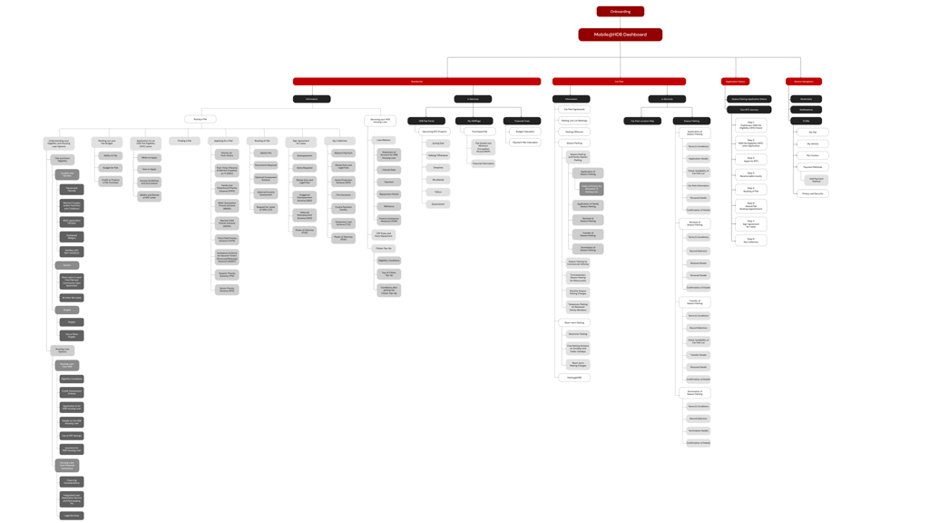
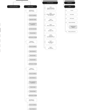
Our primary focus has been on the Car Park and Residential services, reflecting the primary usage patterns of our users. We have created dashboards for these services, ensuring a clear separation between e-services and informational content. Feedback from Jen Zee and Peter Parker, indicated that current information is fragmented. Our new structure aims to streamline navigation, whether users are seeking information about housing grants or applying for season parking. Furthermore, we have optimized the user experience to minimize the number of clicks required to access desired content.
Wireframes

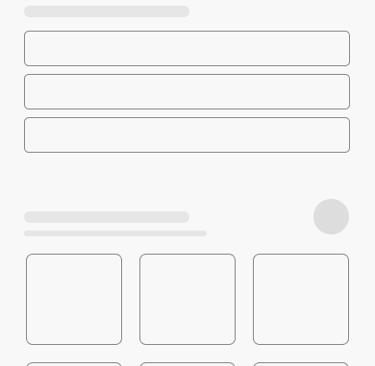
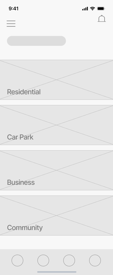
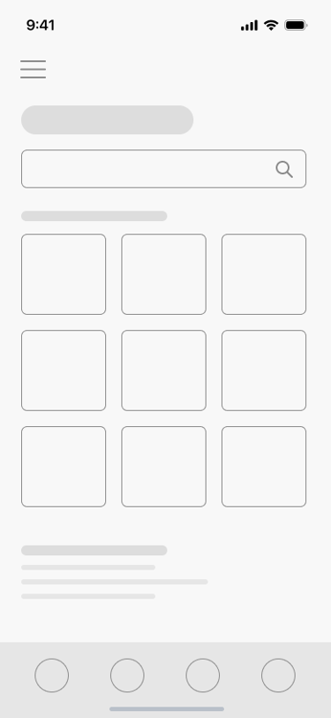
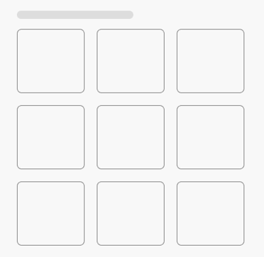
After tying down how the navigation and content was to be designed, we proceeded to sketch out ideas of various pages of the product and did up low fidelity prototypes before moving on to update our stakeholders. Once satisfied, we proceeded to create mockups and work towards our deliverable.
User Testing
For the Mobile@HDB app redesign, we conducted user testing when the prototype reached 75% completion. We tested with 15 participants through both online sessions via Zoom and in-person testing. The unmoderated sessions allowed participants to complete specific tasks and provide real-time feedback on their thoughts and feelings post-task.
To assess usability, we utilized the System Usability Scale (SUS), with our primary metrics focused on how efficiently users could:
Navigate to the BTO Application Status timeline from the dashboard and locate the current pending application status card within 1 minute, with no more than 3 errors.
Find the upcoming Tampines BTO project under the HDB Flat Portal in under 2 minutes, with no more than 3 errors.
The majority of participants successfully completed their tasks, resulting in an average SUS score of 82.7, indicating high usability and user satisfaction. However, three key usability challenges were identified:
One user kept tapping on the onboarding screens instead of swiping.
A user missed the balloting status card on the BTO journey.
Another user missed the bookmark icon in the bottom navbar.
Key findings from usability testing highlighted several areas for improvement:
Navigation elements need to be more intuitive to reduce ambiguity.
Interface cues, such as icons and status cards, should be clearer to prevent user confusion.
Addressing these issues will further refine the app's usability, ensuring a smoother and more seamless experience for users.
Future Recommendation
Prototype
Based on the feedback we gathered from the user testing, we made several changes to ensure a smoother user flow, resulting in a refined and more intuitive final prototype.
Let's look at the improvements we've made to the dashboard design.
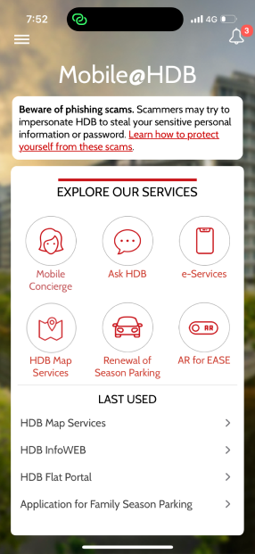
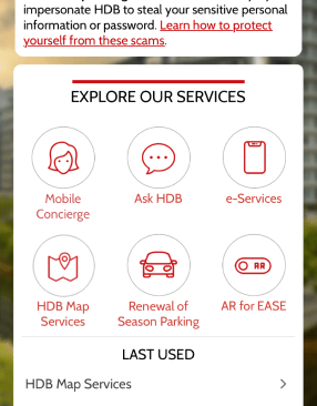

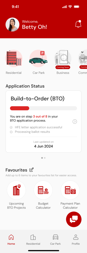
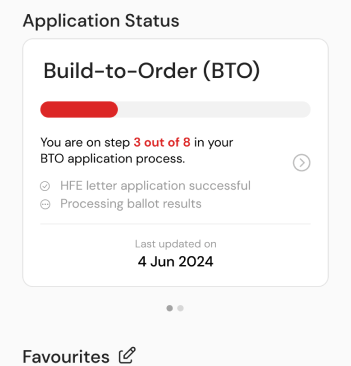
The original app dashboard had a cluttered interface and limited navigation. Our new design offers a sleek, modern interface with streamlined navigation, a personalized greeting, a carousel slider, an application status tracker, and a favorites section.
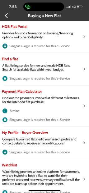
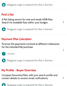

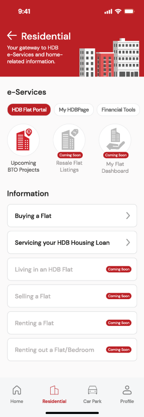
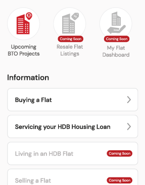

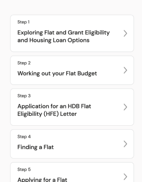
As for the e-Services and information for those looking to buy a flat, changes were made to the flat-buying e-services and information page.
The existing design was hard to navigate and unappealing. The new design is structured, visually appealing, and categorizes sections for easier use, with step-by-step guides and a modern look
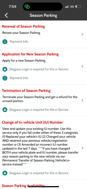
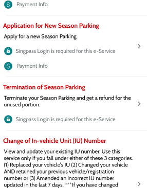

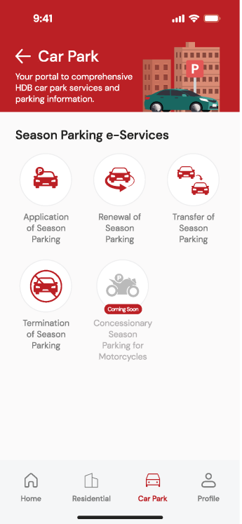
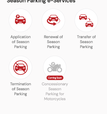
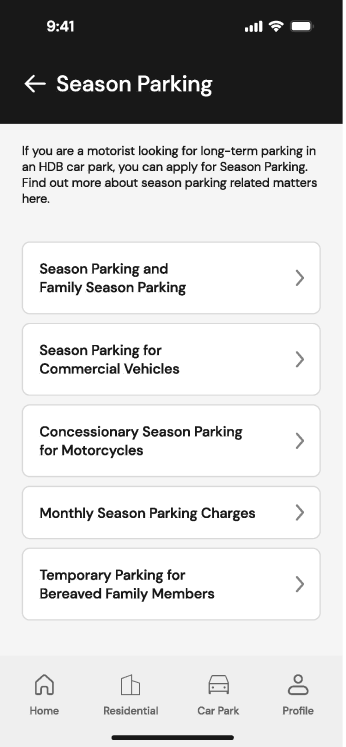
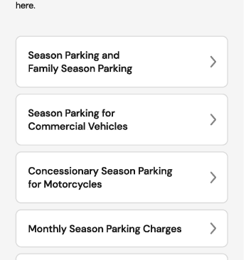
Now you’re looking at the season parking e-services and information page. The new design features a clean, visually appealing interface. It categorizes services for easier navigation and provides clear, concise information.
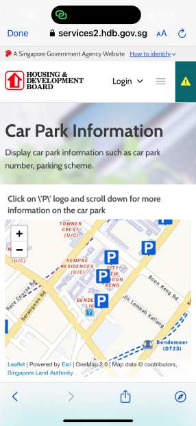
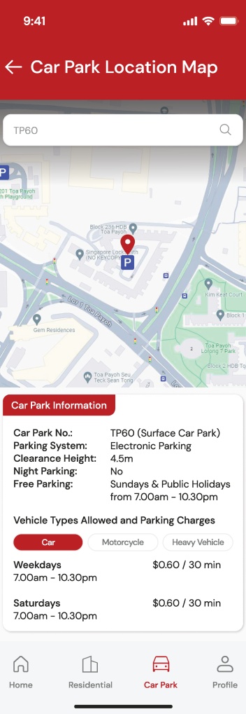
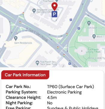

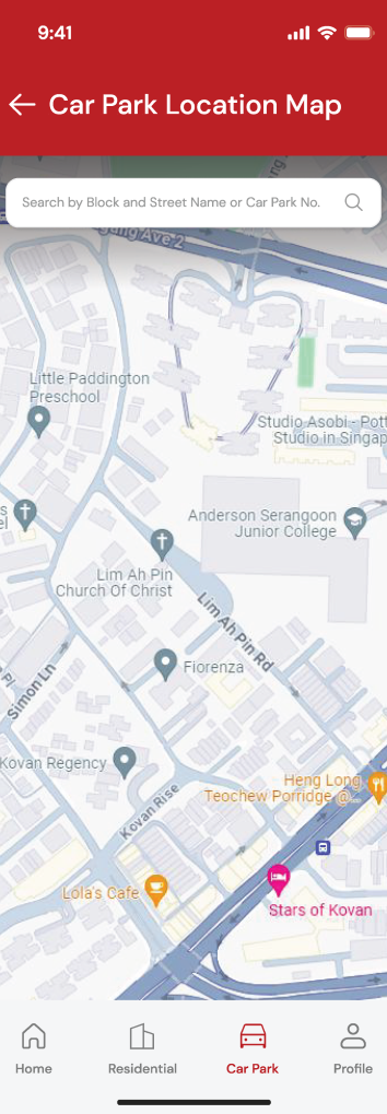
We've revamped the old, cluttered design that made finding car park information difficult and restricted to internet browser searches. Our new design features a clean interface with a searchable map that details parking systems and charges, now available in the app.
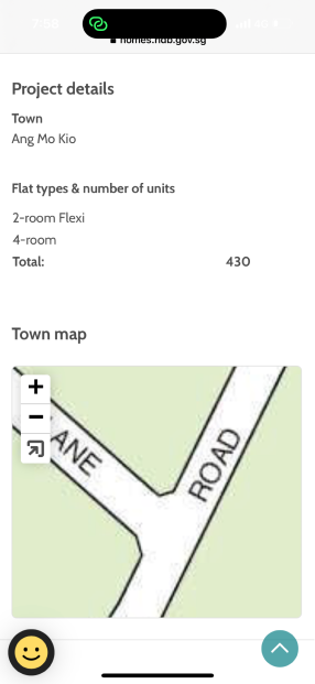
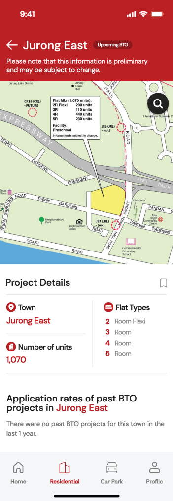
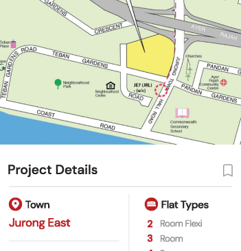
We improved the Upcoming BTO projects page, adding detailed project information, an interactive map, flat types and application rates, enhancing visualization and user experience.
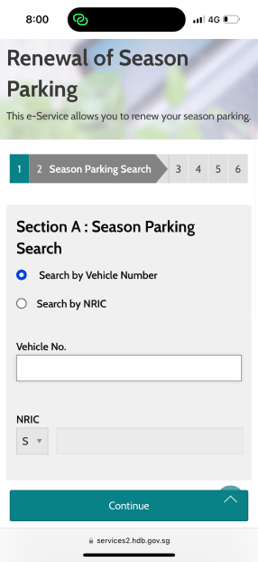
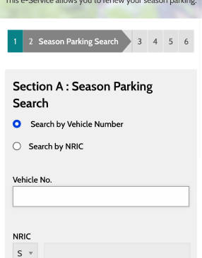

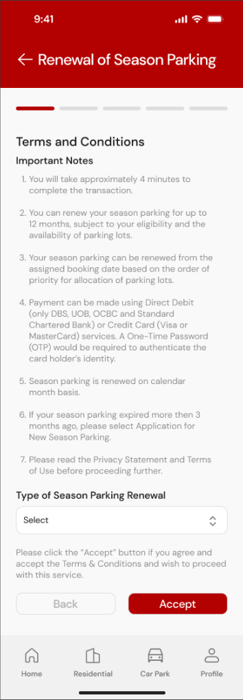
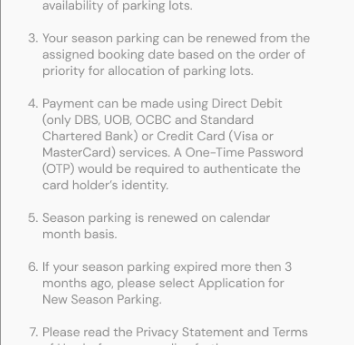

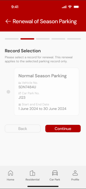
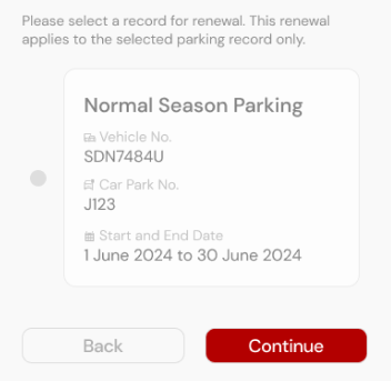
Lastly, we improved the season parking renewal page. The existing design was cluttered and tedious. The new design is clean and simple, making the process faster and easier.
View the Mobile@HDB prototype here!
Conclusion
Collaboration breeds success, as I discovered while working with a team of five on the redesign of a government app. Although we were classmates with strong relationships, we initially encountered challenges due to different work styles. These differences, while causing some friction, ultimately enriched our project by introducing diverse perspectives.
Through open communication and mutual respect, we overcame these challenges and demonstrated how effective teamwork can lead to successful outcomes. Working on a government app instilled a sense of contributing to public service and making a positive societal impact. Recognizing the responsibility of creating a tool that will serve a diverse audience and significantly affect their daily lives was crucial.
Although this redesign was not official, the experience was immensely rewarding. It allowed me to apply my skills to a meaningful cause, collaborate closely with my classmates, and navigate the complexities of real-world design challenges.
